As of March 2017, there are more than 2.8 million apps available on the Google Play Store. The app industry is a lucrative and thriving market, and it shows no signs of slowing down. If you have a penchant for coding and think you’re sitting on the next big idea for an app, you may be wondering what steps you have to take to turn that fledging idea into the next Uber or Airbnb.
After all, knowing how to write the code is only one part of it. To avoid error messages like this, there are numerous other factors to consider before you devote a sizeable chunk of your time and energy into the venture of app building, and of course, before you upload your app to Google Play. Below, we’ll look at some crucial steps when creating an app for Android.
(Guide) Things to Consider when Creating an App for Android Device
App Layout –
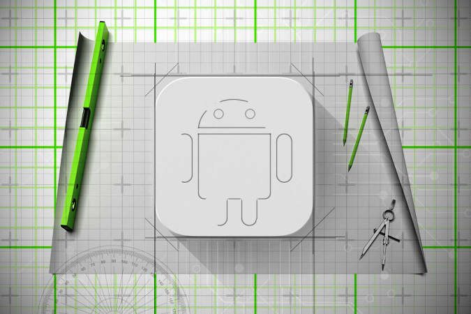
As part of the graphic user interface (GUI), the app layout is one of the most important considerations. It refers to the way in which visual images of the app are positioned and content arranged. You can find ready-made packages that contain elements for user interfaces such as icons, templates, widgets, and colors. For Android designers, you can find a variety of these components from Google’s material design website. The advantage of using these is that they’re attractive, easy to use, and generally painless to set up.
Typography –
Since every app is going to contain at least some text or writing, the typography used is of the utmost importance. Even if symbols or images dominate a large section of your app’s visual real estate, the text used throughout the app should still be considered. Aesthetically it should be pleasing, but the size of the typography should also be taken into account due to the small size of mobile screens. For this reason, many developers choose to use a standardized font for Android apps as they are optimized for operating systems and mobile screens.
Color Scheme –
The color scheme will largely affect how people perceive your app visually; it’s going to tie directly into your corporate identity. When approaching your color scheme, a good starting point is to keep contrast in mind. Successful apps tend to have a good contrast ratio. The reason for this is that most people use their phones when they’re on the run and in many different conditions such as bright sunlight, which might make looking at a screen far more difficult. A good contrast ratio will help your app always to be visible.
Usability –
The usability refers to how user-friendly your app is, or what the user’s perception of your app is. But how does one design and manipulate this? The best way is to think about the app’s functionality, operation, the structure of menus, and the design of the graphic user interface. By improving these, the goal is to make your intuitive app simple, self-explanatory, and easy to use. If your app is too complicated, you’re going to lose your user’s attention; the app should be tidy and clean with concise menus and terse information.







Creating An App For Android Device is the best website application development company