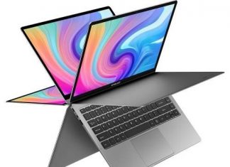
It doesn’t matter all that much how a website is designed when viewing it on a larger display like an LED Cinema Display from Apple or a 17-inch laptop. However, when it’s viewed on a smaller mobile device, that’s different. An iPad, iPhone, Android smartphone, or Windows Phone all have smaller dimensions that make it a challenge to see the details clearly on the screen. At that point, how a site is designed matters much. So check out the importance of Responsive Website Design.

Handling Different Displays & Devices –
Websites used to be designed for different sized displays and web browsers. Back in the days when nothing was compatible, web developers had to manage with the state of technology as it was back then. Thanks to advances in web standards, most web browsers display a web page roughly the same between different browsers and platforms (Windows, Mac, Android, IOS). This provides a high starting point.
Responsive Website Design to the Rescue?
The adaptive design came first. It aimed to adjust the web page based on the screen size. This worked okay on mid-size screens where the column widths became half as wide, and the written copy was still readable. However, on mobile screens, the columns became too small, and the text illegible. A new approach was needed. Enter Responsive Website Design.
Responsive Website Design aims to provide a quality browsing experience, whatever mobile device or larger-screened device is being used. With Responsive Website Design, the page adjusts to the screen size in smart ways to make the website usable for all. It doesn’t just shrink the width of the column but will morph to create a different looking page that looks best for the screen size. If necessary, the two-column display becomes a single column one, prioritizing visibility of content in the first column over displaying both columns poorly.
(Guide) How Responsive Website Design Helps Android & IOS Users?
Not every website is large enough to fund the development of a mobile app. When they don’t have hundreds of thousands or millions of monthly visitors, developing a mobile app is too costly. It’s also a potential headache because an app’s work is never done. There are continuous updates of the code to resolve bugs and add new features. When developing an app, you’re never one and done.
For websites without an app, they need to attract mobile users to their site by making it mobile-friendly, so it reads well on a mobile device. It looks good. None of the information is missing. Features like code compression, page caching and lazy loading of images help reduce the number of bytes downloaded when the page is first loaded so that it can appear on the screen sooner. This all helps to make the mobile experience seem snappier when compared to the almost instantaneous feel when using a downloaded app.
Conclusion:
Finding a specialist in Minneapolis web design that knows all about Responsive Website Design principles is not easy. But it’s worth the time to seek them out if you care about maximizing the usefulness of your website for people who’ll access it on a mobile device. With many sites now receiving as many as half their visitors from mobile devices, not being mobile-ready is missing half your customers.


![[Buy Now] YEPO 737A2 Review Notebook ‘Offer’ Price (Buying Guide) YEPO 737A2](https://www.techinpost.com/wp-content/uploads/2018/01/image001-12-324x235.png)

Your article was astonishing and informative. It was beneficial for me. Hi, I am one of the manager SEO services in New York. In our company, we design a high-quality website and mobile application and SEO service in New York with an affordable price range. We help our customers 24/7 service.